Bromelia Florist
Bromelia Florist
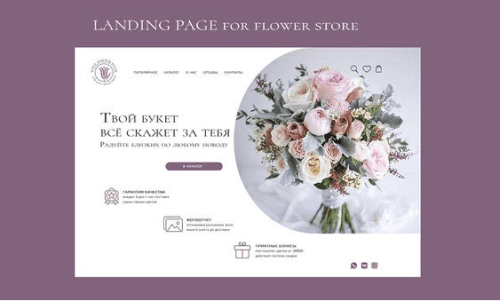
Redesign of a website for a flower shop with a focus on improving its usability and accessibility
Duración del proyecto
4 Days
Rol
UX / UI
Herramientas utilizadas
Figma
WAVE
Attention Insight
Description
Bromelia Florist
Bromelia Florist
Bromelia is a florist specialized in the creation of unique and personalized floral arrangements for various occasions, such as weddings, corporate events, birthdays, and special moments.
It focuses on offering high-quality flowers and a close and detail-oriented service that makes every client feel special.

Problematic
Problematic
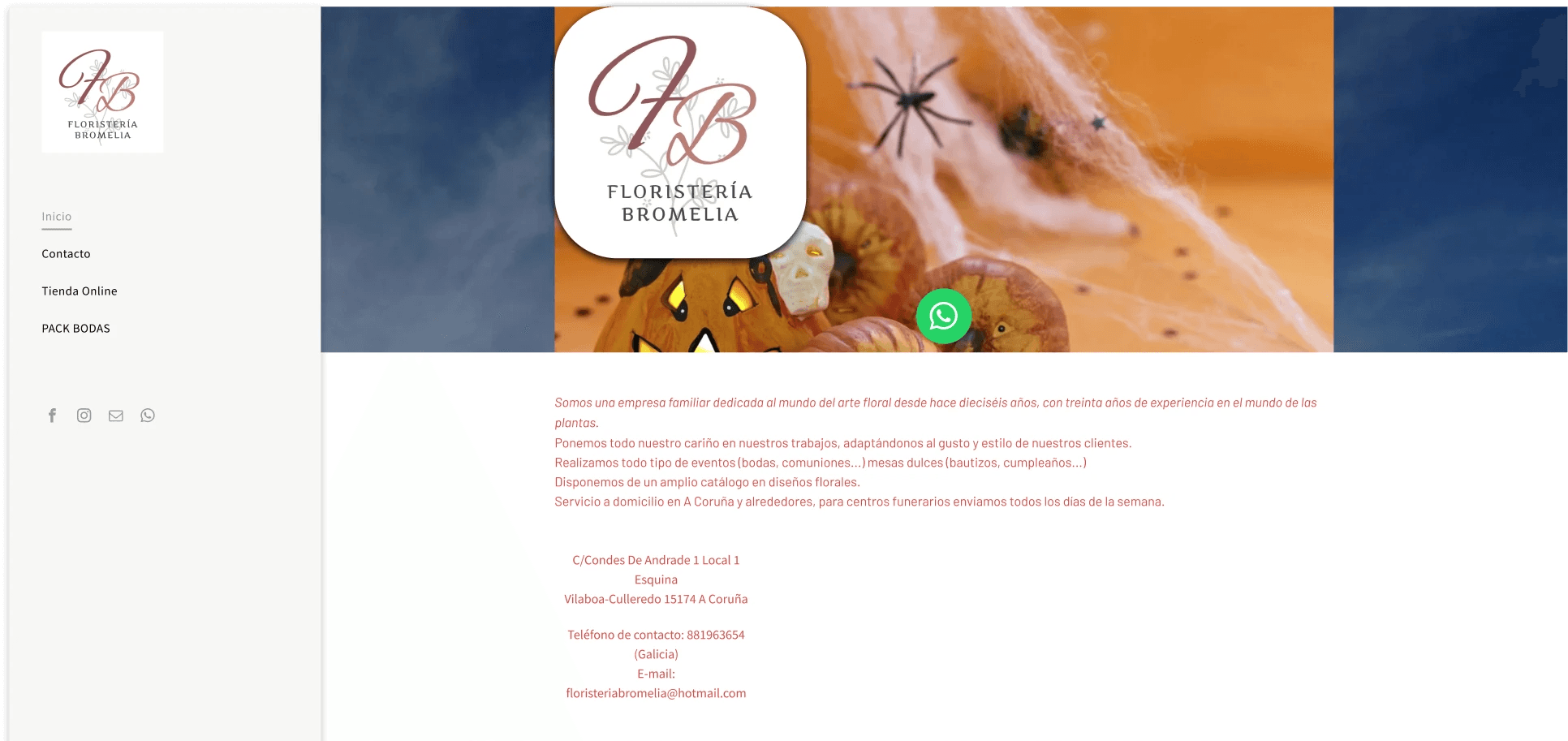
The current Bromelia page presents navigation difficulties, which prevents users from easily finding products and sections. Additionally, the purchasing process is not smooth. The site's aesthetics also do not reflect the warmth and elegance that characterizes the brand.
The current Bromelia page presents navigation difficulties, which prevents users from easily finding products and sections. Additionally, the purchasing process is not smooth. The site's aesthetics also do not reflect the warmth and elegance that characterizes the brand.
Objectives
Objectives
• Enhance the User Experience: Navigation should be intuitive and allow users to explore categories clearly and without distractions.
• Reflect the Brand's Personality: We want an aesthetic that evokes nature and warmth. Bromelia is inspired by green, warm tones, and vibrant flowers, so the design should project a cozy feeling that is close to nature.
Analysis
Wave (Web Accessibility Evaluation Tools)
Wave (Web Accessibility Evaluation Tools)
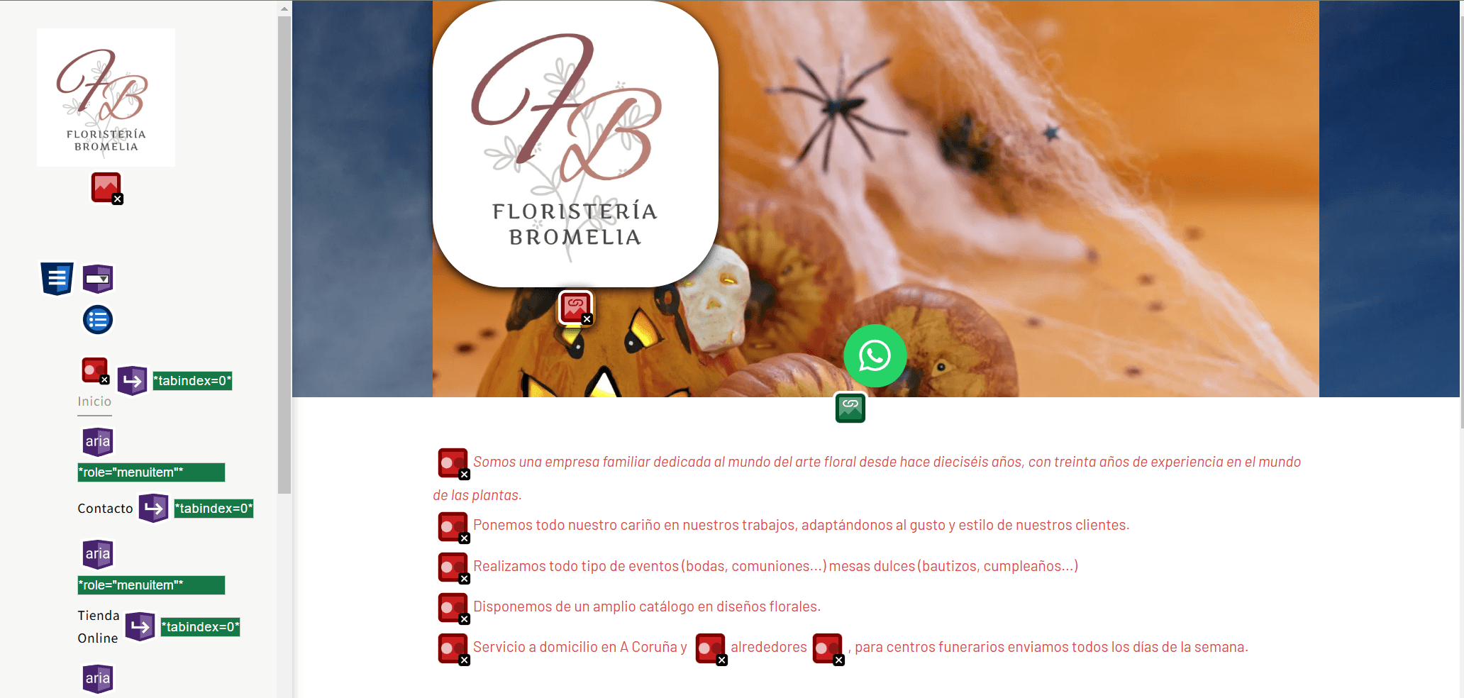
It is a tool that automatically evaluates web accessibility and provides you with details about errors or alerts based on the WCAG (Web Content Accessibility Guidelines) guidelines.
It is a tool that automatically evaluates web accessibility and provides you with details about errors or alerts based on the WCAG (Web Content Accessibility Guidelines) guidelines.
Original design
WAVE Analysis
Overall analysis results:
Accessibility Errors: Elements were detected that present accessibility issues, such as insufficient color contrast, missing or incorrect labels on images.
Contrast Issues: There are several areas of the site with color contrasts that do not meet accessibility standards, which could hinder reading for individuals with low vision.
Inappropriate Use of Headings: The heading structure is inconsistent, affecting visual hierarchy and making navigation difficult for users of assistive technologies.
Arquitectura de la información
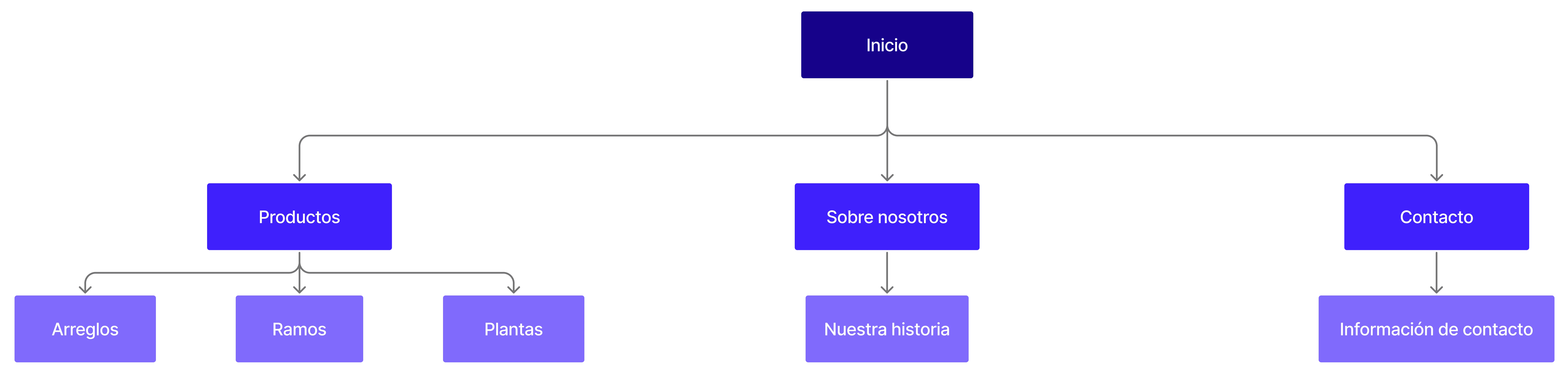
The information architecture for the redesign of the website was created with the aim of improving navigation and accessibility, making it easier for users to quickly find the products and services of the florist. The structure has been designed around three main sections: Shop, About Us, and Contact, each with subcategories that meet the information needs of users.
This organization allows for intuitive access to key areas, such as the floral arrangements and plants available for purchase in the shop, the contact channels, and information about the team, thus providing a smooth user experience that is consistent with the brand identity.
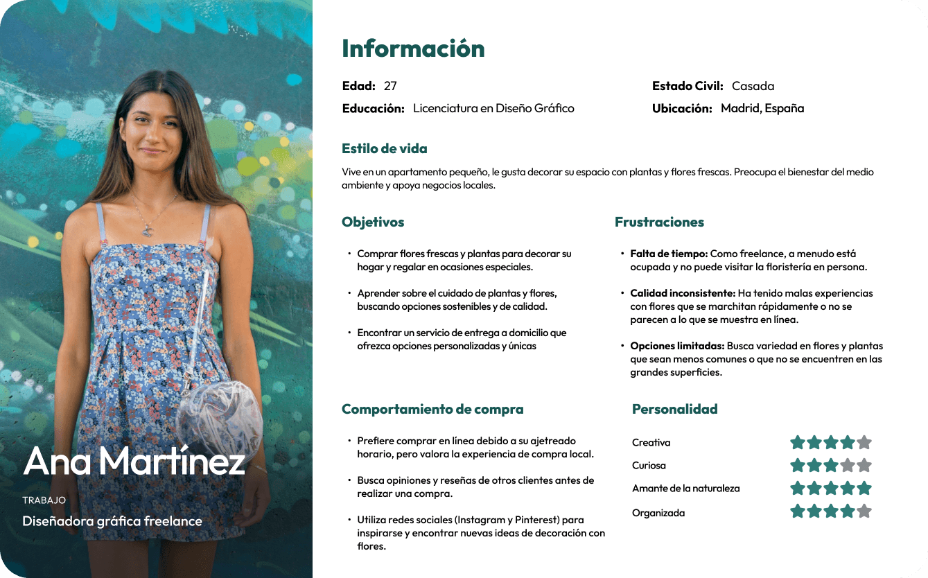
user persona
Ana Martínez's User Persona adds significant value to the flower shop project by representing an ideal client with a focus on sustainability and quality. Her profile allows for market opportunity identification, personalizing the shopping experience, and developing effective marketing strategies.
Moreover, understanding her needs and pain points guides innovation in products and services, fostering customer loyalty and differentiating the flower shop from the competition.
By aligning with her values, the business can offer a memorable experience that drives growth and word-of-mouth recommendations.
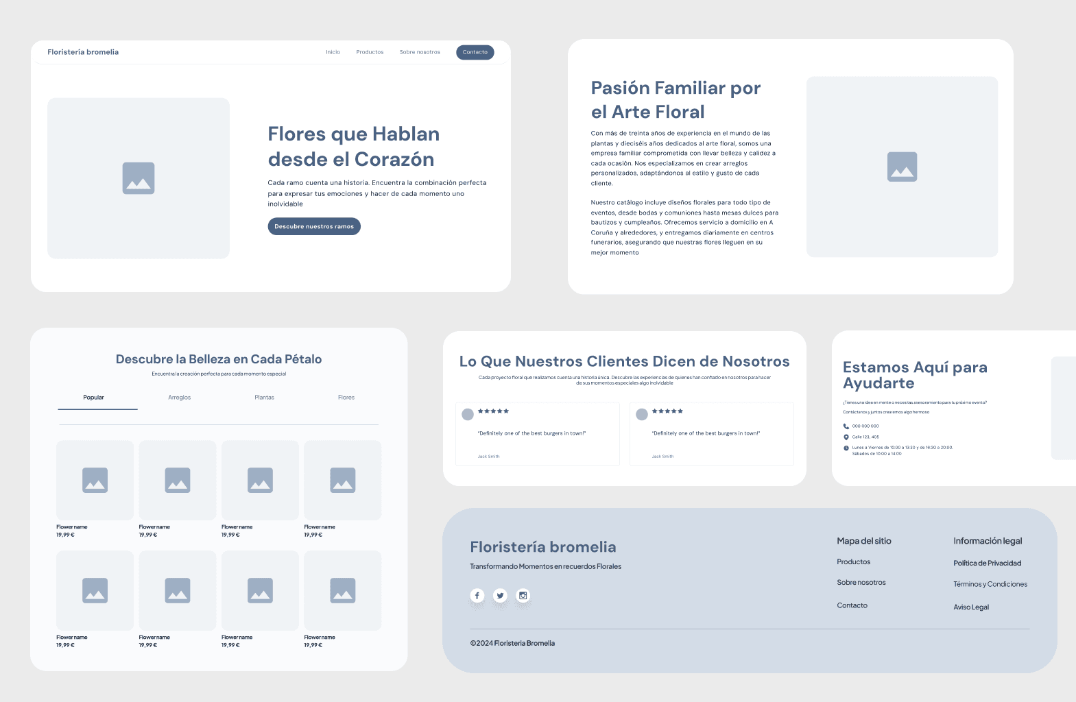
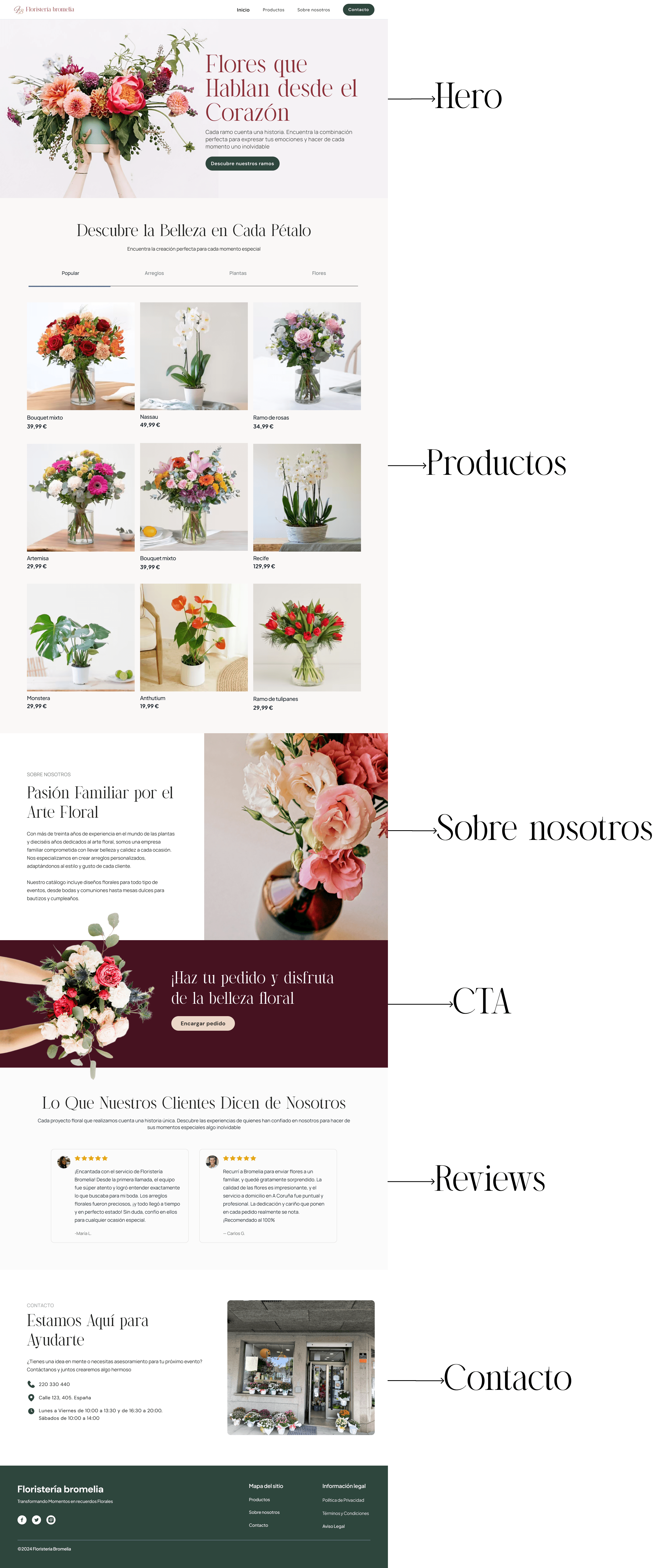
Wireframes
At this stage of the project, I developed the wireframes with the aim of improving user experience and clarity in navigation.
The wireframes allow for an initial visualization of the structure and hierarchy of the content, organizing key sections such as the main hero, the product catalog, the "About Us" section, customer reviews, and contact details. Each element has been placed strategically to maximize usability and facilitate users in exploring the florist's services, thus achieving a smooth and accessible experience in each section of the page.
Visual design
Considering the chosen visual direction and the selected examples, create an initial low-fidelity design to achieve a functional prototype.
Considering the chosen visual direction and the selected examples, create an initial low-fidelity design to achieve a functional prototype.


prototype
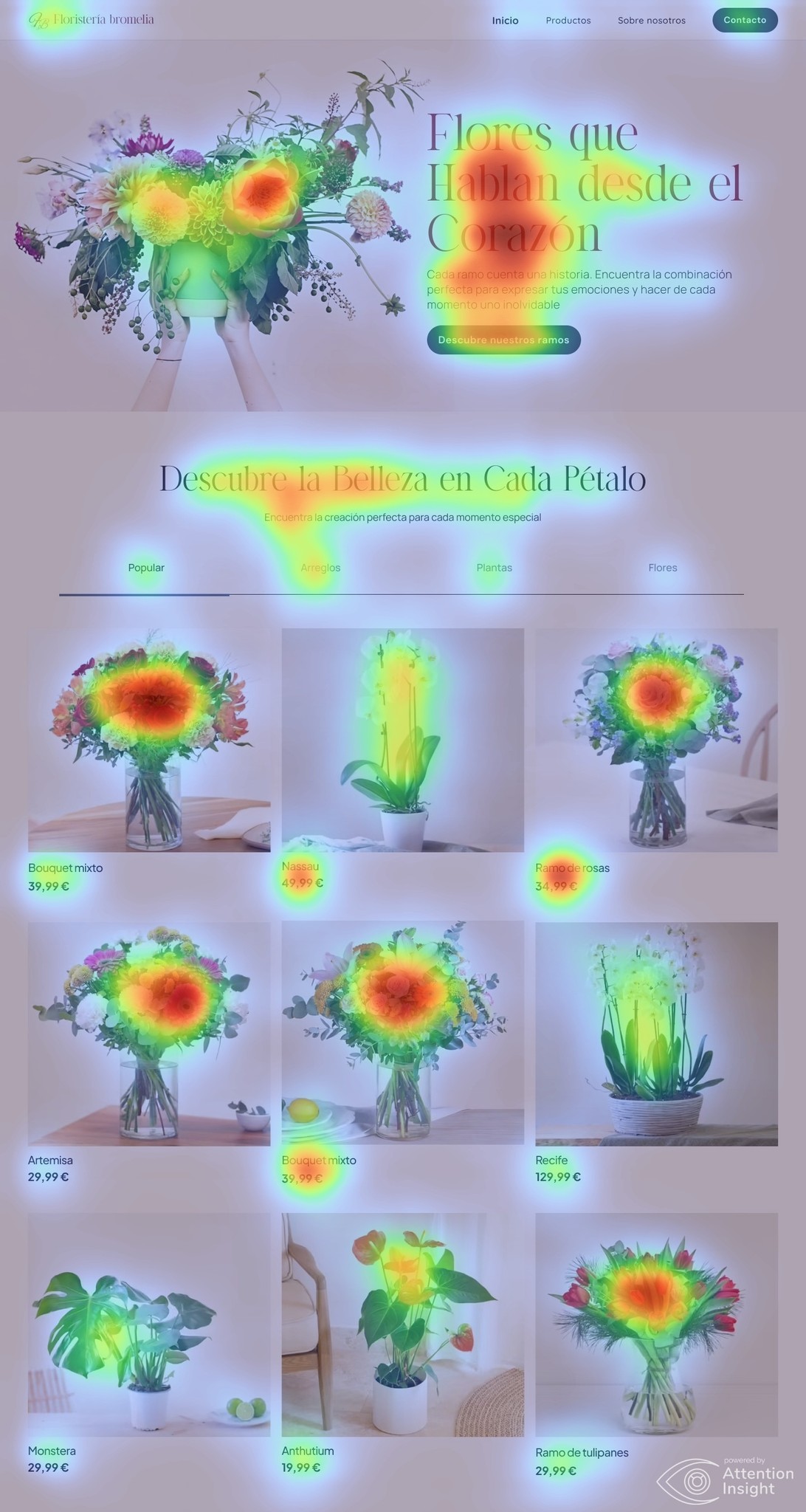
heatmap
Attention Insight (technology based on eye tracking or eye tracking)
Attention Insight (technology based on eye tracking or eye tracking)
I used the heat map to analyze how users view and navigate the landing page, focusing on observing their reading pattern. This analysis allowed me to identify the sections of highest and lowest attention, which is key to understanding how users naturally interact with the elements on the screen.
This information serves as a basis for possible improvements in the design, aligning the visual structure with users' reading preferences.
General conclusions
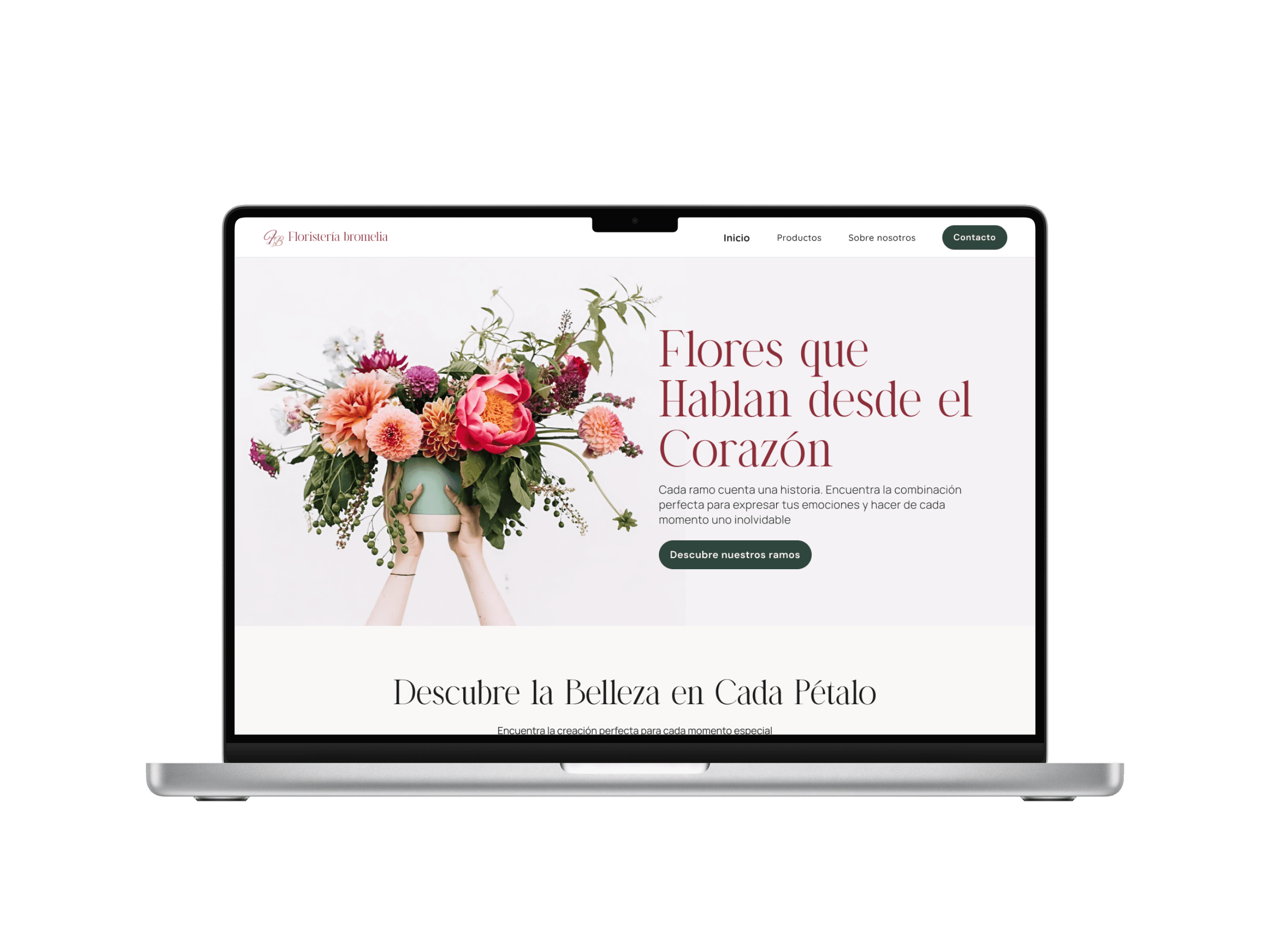
The redesign of the Bromelia website was carried out with three key objectives: to improve user experience, optimize the purchasing process, and reflect the brand's personality. Through clear and intuitive navigation, product exploration was facilitated, eliminating distractions for a smooth experience.
The new navigation allows for clear and intuitive exploration of the page, offering a smooth experience for the user. The design faithfully reflects the essence of Bromelia, with a palette of warm tones and green color accents that evoke nature and warmth.
This approach conveys a cozy and approachable aesthetic, aligned with the brand's identity.