Supporty
Supporty
Chatbot designed to provide emotional support and improve the mental health of its users.
Chatbot designed to provide emotional support and improve the mental health of its users.
Project duration
3 Months
3 Months
Roll
UX / UI
UX / UI
Tools used
Figma
Optimal Workshop
Figma
Optimal Workshop
Description
What is Supporty?
What is Supporty?
It is an app that offers its users a series of tools and activities for managing emotions, and it also has a forum where you can freely express yourself with community users in a safe space.
It is an app that offers its users a series of tools and activities for managing emotions, and it also has a forum where you can freely express yourself with community users in a safe space.
Problemática
Problemática
Despite the help available, health centers are unable to meet the high demand; approximately, the waiting time to schedule an appointment with a specialist is three to four months.
Despite the help available, health centers are unable to meet the high demand; approximately, the waiting time to schedule an appointment with a specialist is three to four months.
Object
Object
Provide users with a safe, easily accessible space where they feel comfortable expressing their emotions, with the help of professionals for psychological support, without the need for a prolonged wait.
Provide users with a safe, easily accessible space where they feel comfortable expressing their emotions, with the help of professionals for psychological support, without the need for a prolonged wait.
User research
Interviews
Interviews
To validate the issues and needs of the users, 5 interviews were conducted with people whose profiles resembled those of our potential users; these are some of the obtained responses:
To validate the issues and needs of the users, 5 interviews were conducted with people whose profiles resembled those of our potential users; these are some of the obtained responses:
Question: What motivates you to seek support?
Question: What motivates you to seek support?
"Listen to a different version of the problem"
"I don't have the right tools"
"To have a second opinion"
"Being unable to solve the problem on my own"
"Not feeling judged and being able to vent in peace"
Benchmarking
Benchmarking
A comparative analysis was conducted on competitor applications, identifying different aspects that we must take into account when developing our product.
A comparative analysis was conducted on competitor applications, identifying different aspects that we must take into account when developing our product.
Aplicaciones similares

Benchmarking conclusion
Benchmarking conclusion
The best application in terms of functionality, interface, and reviews is Yana, so we must meet those standards when creating our app and adding other functions or tools to provide an improved version.
Meyo has several positive reviews, but it lacks uniformity in its interface (the color choice has a low ratio level of 1.48), some of its content does not adapt correctly to different screens, and the main focus is on videos and audios.
Amaha is by default in English, but many people choose to use it even though it does not have a Spanish version. It is comprehensive in terms of content, has several options and tools for users, although it is worth noting that the interface looks a bit cluttered (buttons, icons, content blocks) which could overwhelm the user using it.
The best application in terms of functionality, interface, and reviews is Yana, which is why we must meet those standards when creating our app and adding other features or tools to provide an improved version.
Meyo has several positive reviews but lacks consistency regarding its interface (the color choice has a low ratio of 1.48), some of its content does not adapt correctly to different screens, and the main focus is on videos and audio.
Amaha is by default in English, but many people choose to use it even though it does not have a Spanish version. It is comprehensive in terms of content, has various options and tools for users, although it is worth noting that the interface looks a bit cluttered (buttons, icons, content blocks), which could overwhelm the user using it.
User Persona
User Persona
Main user of our application
Main user of our application
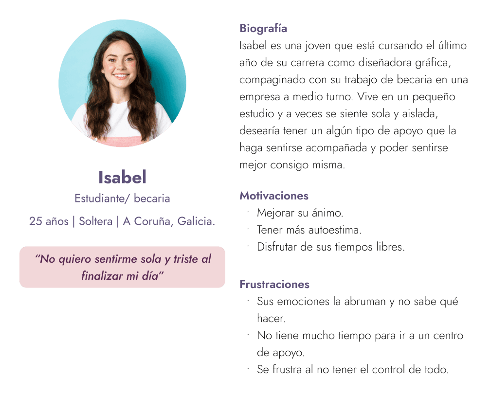
Why this user?
Isabel would be a perfect user for this app as it will allow her to have extra support to express her emotions and feel accompanied at any moment.
Isabel would be a perfect user for this app as it will allow her to have extra support to express her emotions and feel accompanied at any moment.
Wireframes
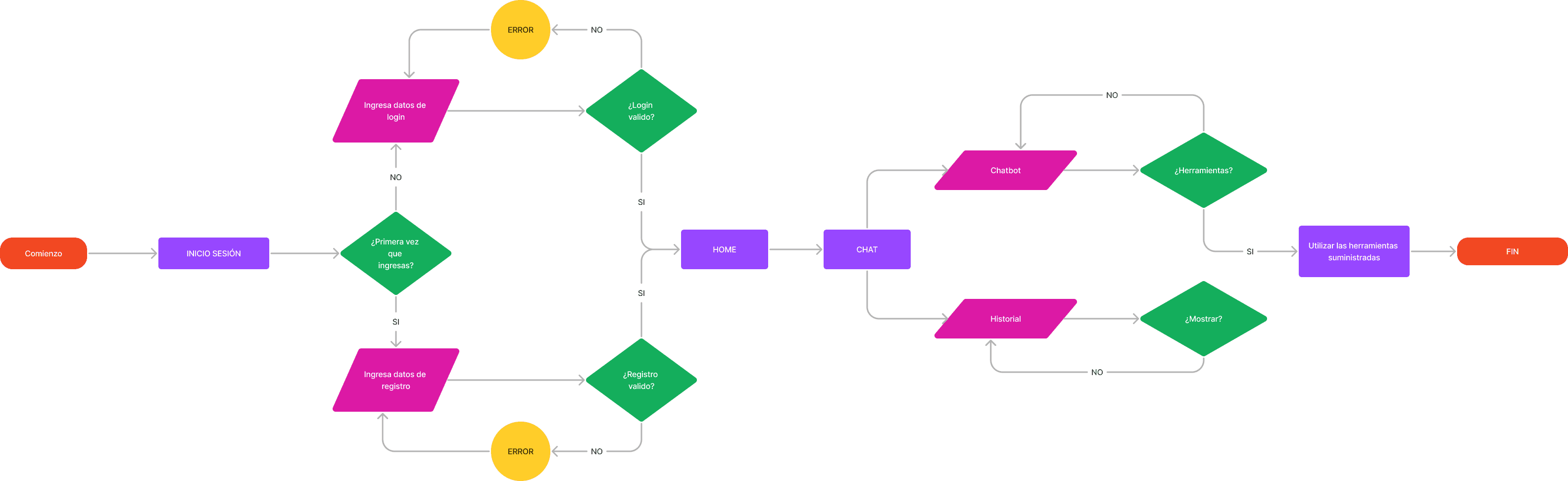
User Flow
User Flow
User flow process for the two types of users we would have in our app
User flow process for the two types of users we would have in our app.
Information architecture
Information architecture
The first proposal is shown at the beginning, after iterating and analyzing our card sorting and dendrogram results again, we iterated over it, showing the final result at the bottom.
The first proposal is shown at the beginning, after iterating and analyzing our card sorting and dendrogram results again, we iterated over it, showing the final result at the bottom.
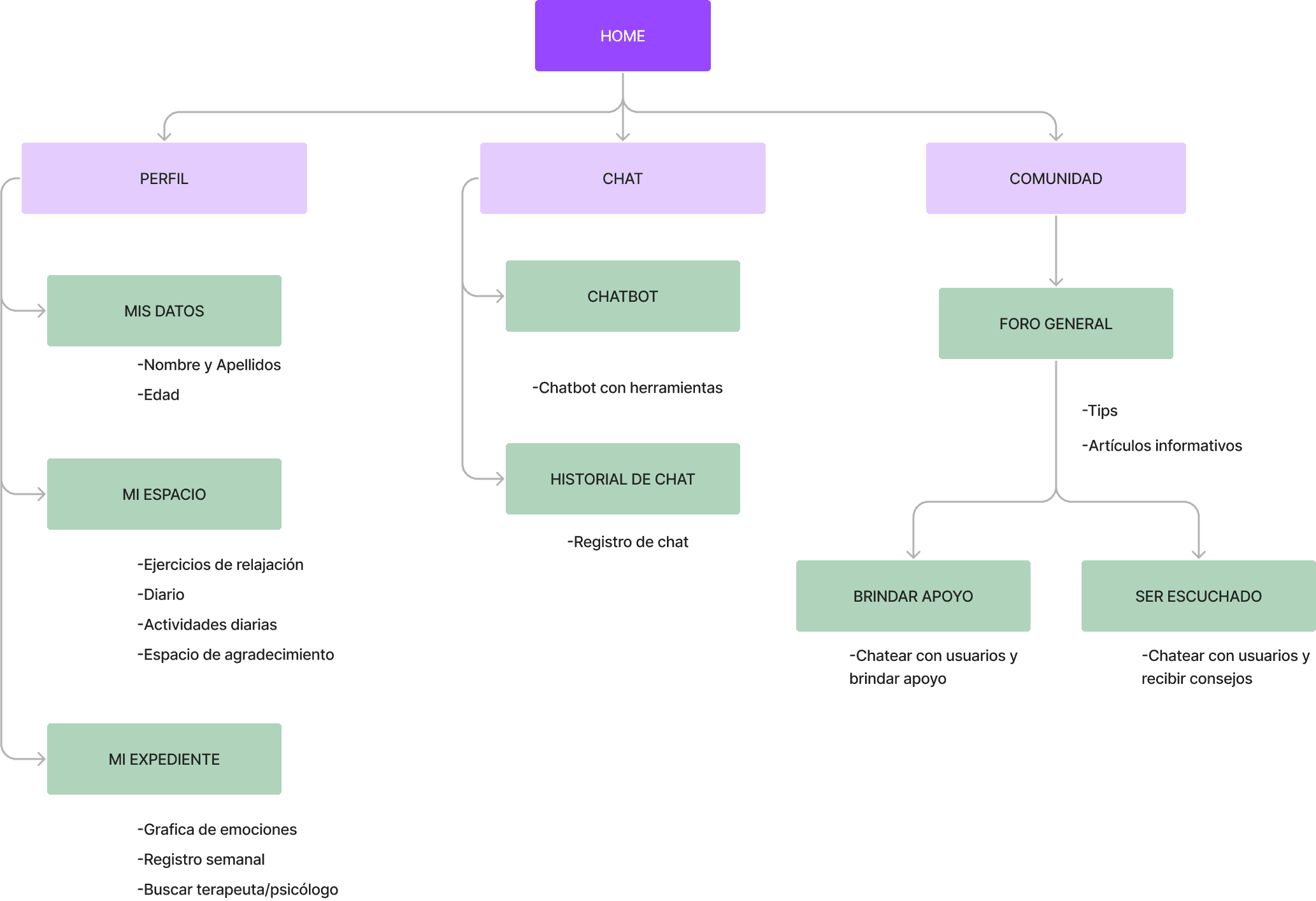
First proposal
First proposal
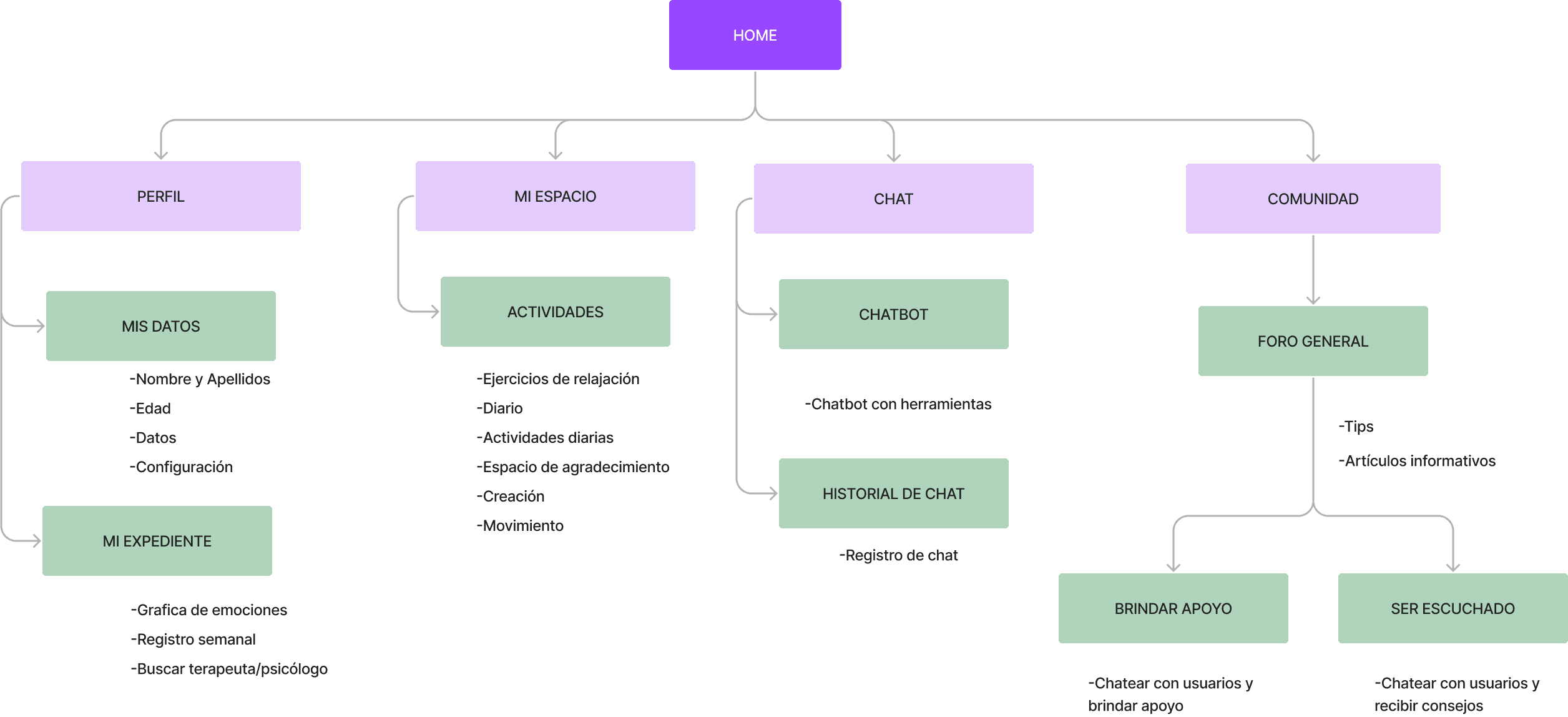
Final result
Final result
Medium fidelity wireframes
Medium fidelity wireframes
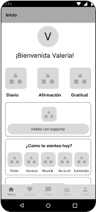
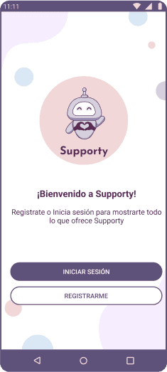
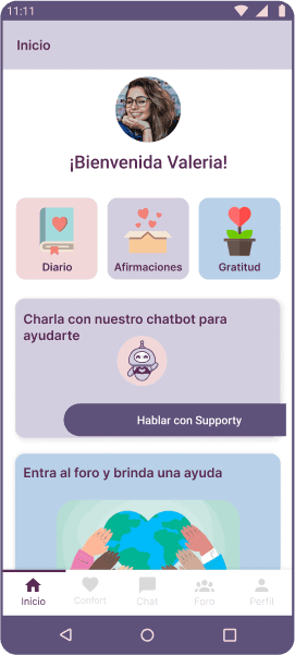
Homepage
Home page
Homepage
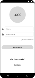
Log in
Log in
Log in
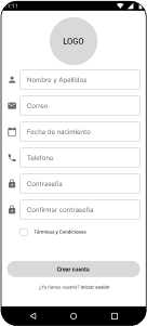
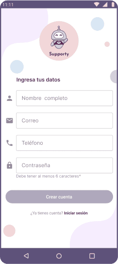
New registration
New registration
New registration
Welcome
Welcome
Welcome
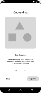
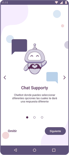
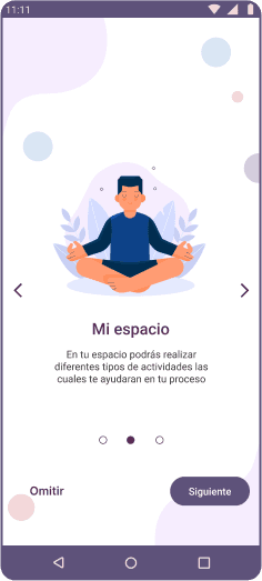
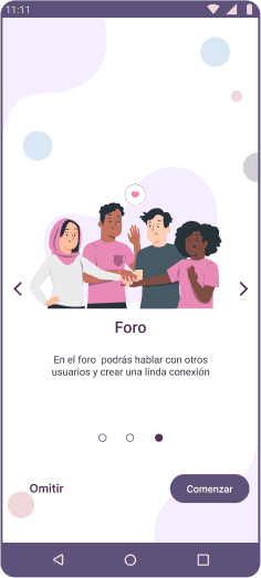
Onboarding
Onboarding
Onboarding
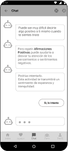
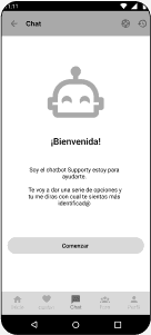
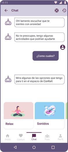
Chatbot
Chatbot
Chatbot

Start of activity
Start of activity
Start of activity
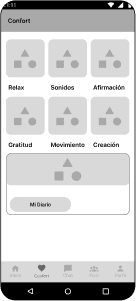
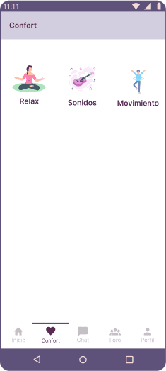
Comfort zone
Comfort zone
Comfort zone
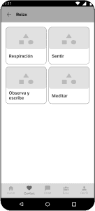
Activity subcategory
Activity subcategory
Activity subcategory
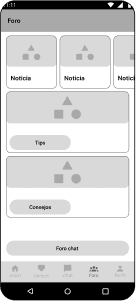
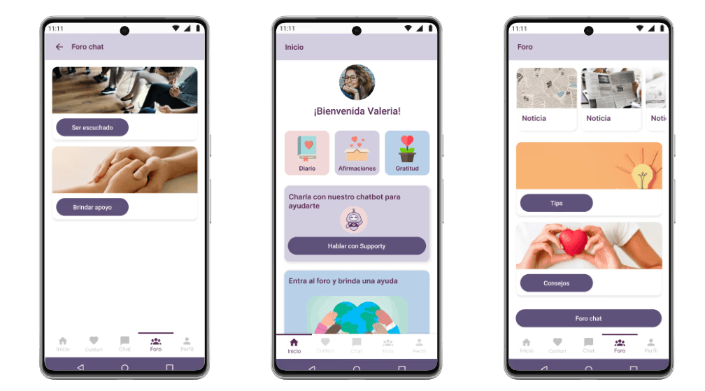
Forum
Forum
Forum
Chat Forum
Chat Forum
Chat Forum
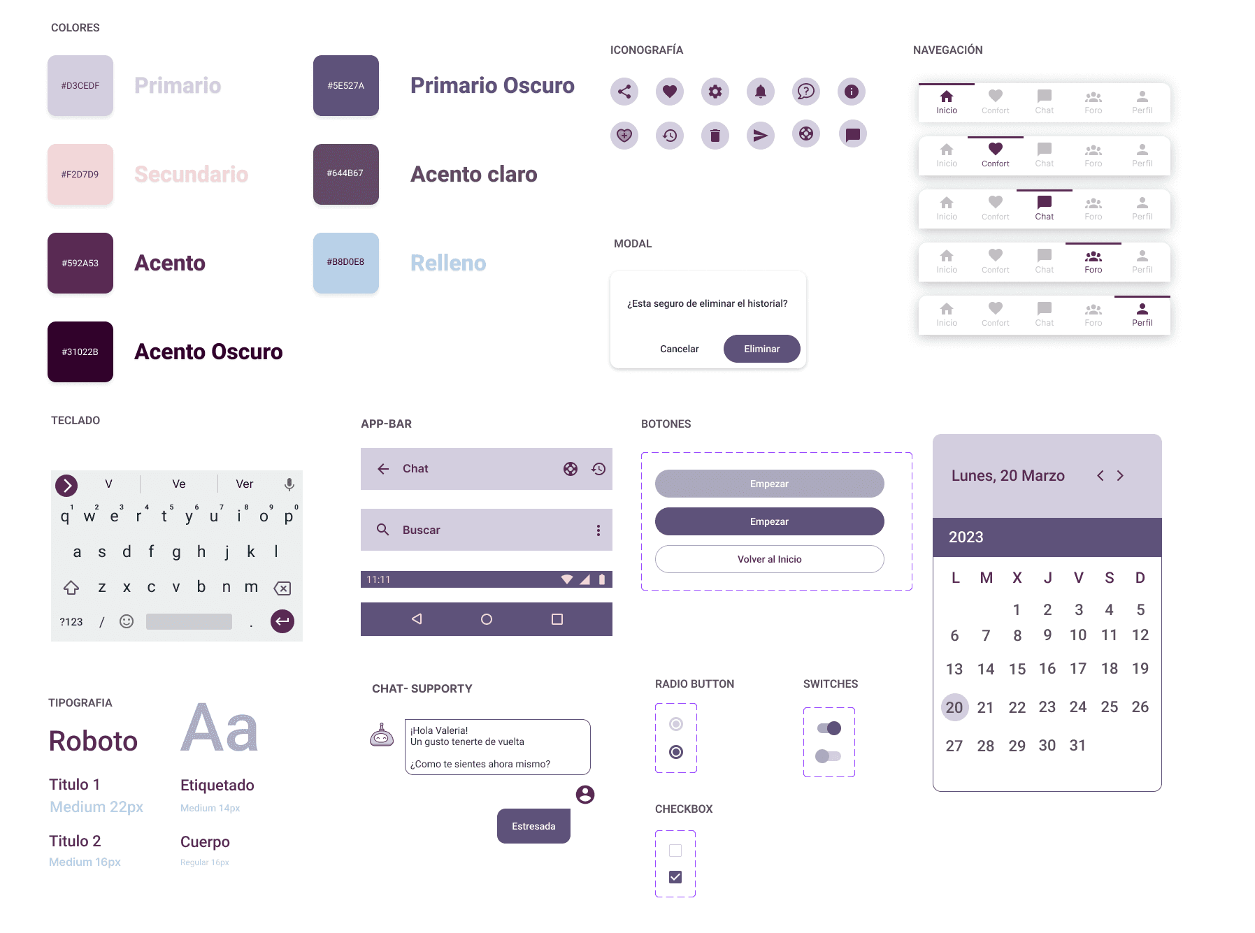
UI Kit
UI Kit
High fidelity prototype
High fidelity prototype
Register
Register
Log in
Log in
Onboarding
Onboarding
Start
Start
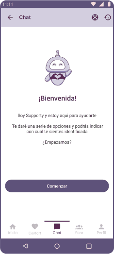
Chat start
Chat start
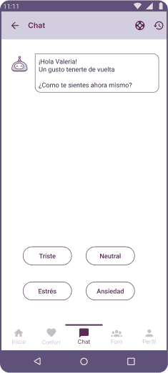
Chat options
Chat options
Chat options
Comfort space
Comfort space
Activity in progress
Activity in progress
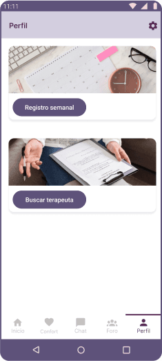
Perfil
Perfil
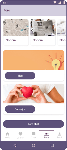
Forum
Forum
Feedback
Feedback
Positive
Positive
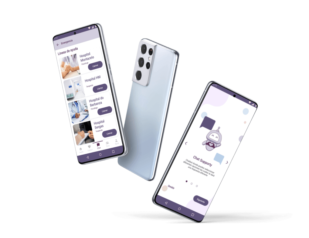
"Lifebuoy" button for emergency situations.
The onboarding is clear and easy to understand.
Visually, it maintains a consistent pattern.
• "Lifebuoy" button for emergency situations.
• The onboarding is clear and easy to understand.
• Visually, it maintains a consistent pattern.
Points to improve
Points to improve
Some flows did not have a clear direction.
In certain views, the contrast does not meet the minimum accessibility standards.
Some activities were repetitive.
• Some flows did not have a clear direction.
• In certain views, the contrast does not meet the minimum accessibility requirements.
• Some activities were repetitive.
Personal conclusion
Personal conclusion
It was quite a challenge to carry out this project as a UX-UI designer; being the first, it was a deeply enriching experience. I enjoyed the enthusiasm of learning new concepts and putting them into practice. Each completed stage brought me closer to my final product, and although there will always be aspects to improve, I am proud to have achieved this result.
It was quite a challenge to carry out this project as a UX-UI designer; being the first, it was a deeply enriching experience. I enjoyed the enthusiasm of learning new concepts and putting them into practice. Each completed stage brought me closer to my final product, and although there will always be aspects to improve, I am proud to have achieved this result.